

Website design affects whether visitors understand your offer, trust your business, and take action. Common website design mistakes can create friction across navigation, mobile usability, page speed, typography, accessibility, and calls to action. A professional website needs more than an attractive layout; every page should help visitors find information and move toward a relevant conversion.
1. Confusing Navigation
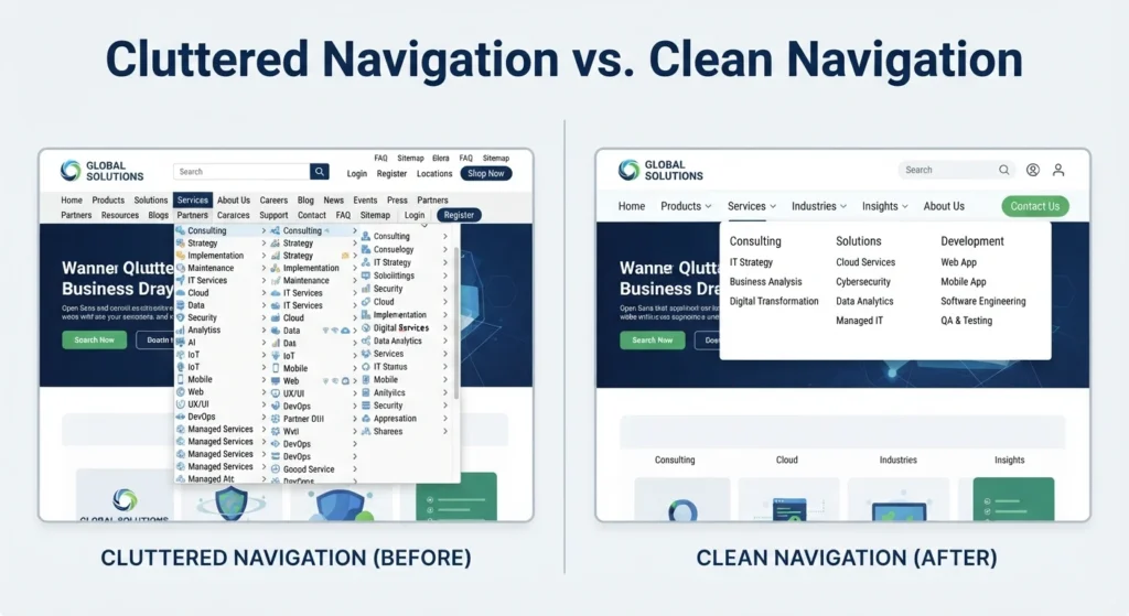
Confusing navigation makes important pages difficult to find and creates unnecessary friction. Use clear menu labels, logical page groups, and visible links to core pages such as services, products, pricing, and contact information. Keep the main navigation focused rather than filling menus with every available page.
Bad navigation can hide valuable content behind vague labels, crowded dropdowns, or excessive clicks. Review the navigation from a first-time visitor’s perspective. A visitor should understand where a menu item leads before selecting it, and important conversion pages should remain easy to reach.
2. Slow Page Load Speed
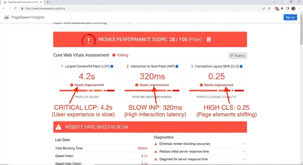
Slow page load speed can reduce engagement and conversions because visitors cannot interact with your content quickly. Large image files, unnecessary scripts, excessive third-party tools, and poorly optimized code can delay page rendering.
Use compressed images, modern image formats, efficient scripts, and reliable hosting to improve performance. Test important pages with Google PageSpeed Insights and review metrics such as Largest Contentful Paint (LCP), Interaction to Next Paint (INP), and Cumulative Layout Shift (CLS). A fast website should remain stable while content loads.
3. Poor Mobile Responsive Design
A website that works well on desktop but performs poorly on smartphones creates a direct usability problem. Text can become difficult to read, buttons can become too small, and forms can require unnecessary scrolling or zooming.
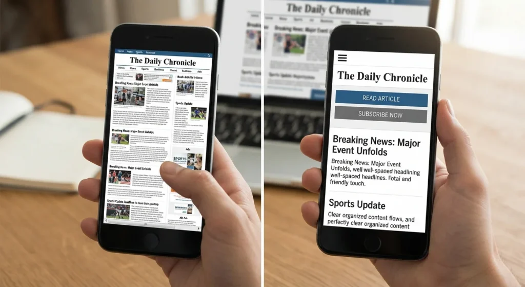
Use responsive design so layouts, images, menus, and interactive elements adapt to different screen sizes. Test real phones as well as desktop browsers. Check the homepage, service pages, product pages, checkout process, menus, and contact forms because mobile visitors often complete high-value actions on smaller screens.
4. Weak Calls-to-Action
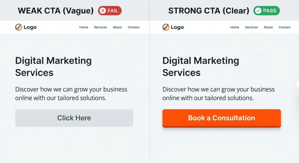
A weak or missing call-to-action (CTA) leaves visitors uncertain about the next step. Every important page needs a clear action that matches the visitor’s intent, such as “Request a Quote,” “Book a Consultation,” “Buy Now,” or “Contact Us.”
Place relevant CTAs near important decision points without filling every section with competing buttons. Use specific wording that explains the action and destination. A strong CTA should remain visually distinct, accessible, and easy to locate on both desktop and mobile layouts.
5. Poor Typography and Color Contrast
Typography and colour selection directly affect readability. Tiny fonts, decorative typefaces, tight spacing, and low contrast can make useful information difficult to consume, especially on smaller screens.
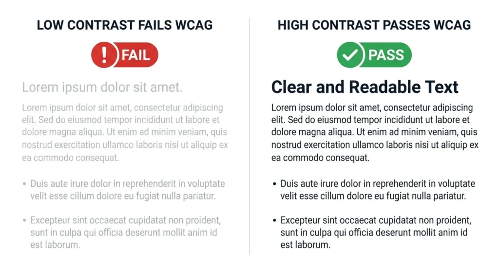
Choose readable fonts, sufficient line spacing, and strong contrast between text and backgrounds. Maintain a clear visual hierarchy so visitors can distinguish headings, supporting information, buttons, and key details. Accessibility should guide these choices because a design that looks acceptable to one visitor can remain difficult for another visitor to use.
6. Excessive Clutter
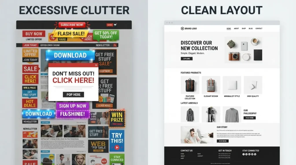
Excessive clutter makes pages harder to scan and can weaken the focus of the primary conversion action. Too many banners, animations, pop-ups, images, buttons, or unrelated messages compete for attention.
Give every page a defined purpose and remove elements that do not support that purpose. Use white space to separate related content and create clear visual groups. White space does not mean leaving a page empty; effective spacing helps visitors process information and identify important actions faster.
7. Intrusive Pop-Ups and Overlays
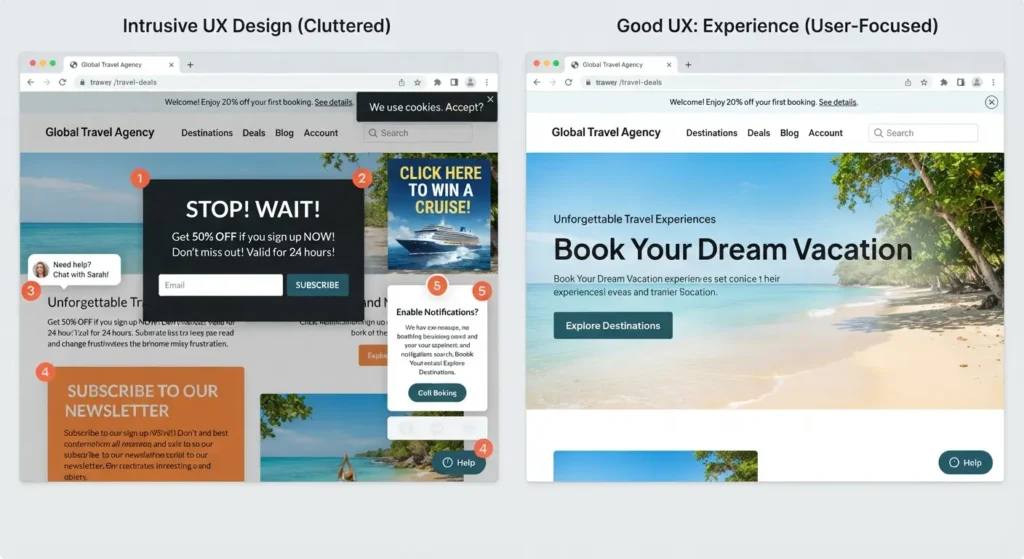
Pop-ups can support lead generation, but intrusive overlays can interrupt visitors before visitors understand the page. Multiple newsletter prompts, live chat windows, cookie notices, and promotional overlays can cover content and weaken trust.
Use pop-ups only when the message has a clear purpose. Give visitors an obvious close control and avoid stacking several interruptions at the same time. Test timing, frequency, placement, and mobile behavior so promotional elements do not block essential content or forms.
8. Unclear Value Proposition
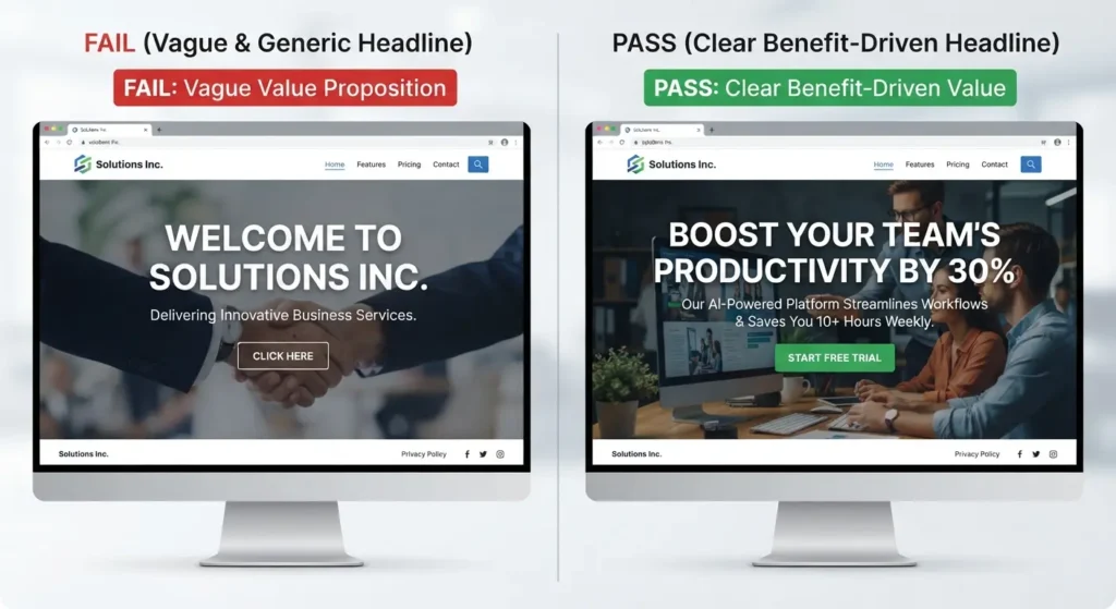
Visitors should understand what your business offers and why the offer matters without searching through several sections. An unclear value proposition forces visitors to interpret vague headlines instead of quickly confirming relevance.
Write a specific headline that identifies the product or service and the primary customer benefit. Support the headline with concise evidence, relevant details, and a clear CTA. The first visible section of a page should establish purpose rather than rely on generic statements. Choose website design packages that match your business goals, required features, and conversion priorities.
9. Missing Trust and Contact Information
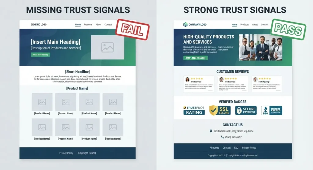
Visitors need evidence before committing to a purchase, inquiry, or consultation. Missing reviews, project examples, business details, policies, or contact options can weaken confidence even when the core service is strong.
Make contact information easy to find and provide appropriate options such as phone, email, forms, or location details. Show relevant testimonials, case studies, credentials, guarantees, or real project images where applicable. Accurate information should remain consistent across important pages.
10. Broken Links, Forms, and Poor Maintenance
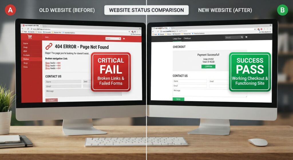
Broken links and failed forms can stop conversions after a visitor has already decided to act. Outdated service details, missing pages, expired offers, and software issues can create the same problem.
Check key links, buttons, forms, checkout steps, and contact methods on a regular schedule. Test confirmation messages and email notifications after form submissions. Keep website software, integrations, and content updated so technical failures do not silently interrupt the customer journey.
11. Ignoring Accessibility
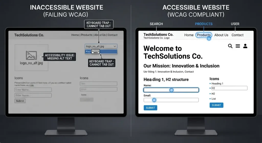
Accessibility problems can prevent visitors from reading content, navigating menus, or completing forms. Common issues include low contrast, missing form labels, inadequate image alt text, and navigation that depends entirely on a mouse.
Build accessibility into design and testing rather than treating accessibility as a final adjustment. Check keyboard navigation, focus states, labels, headings, text contrast, and alternative text. Automated tools can identify some issues, but human review remains important for practical usability.
12. No Testing or Conversion Measurement
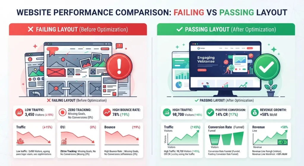
A website cannot improve through design assumptions alone. Without analytics, usability checks, and conversion measurement, you cannot reliably identify which pages lose visitors or which elements support action.
Track relevant conversion metrics such as form submissions, purchases, qualified leads, and CTA interactions. Review behavior reports and test meaningful design changes when sufficient data exists. Compare page performance before and after changes instead of judging a redesign only by visual appearance.
13. Unclear Content Structure
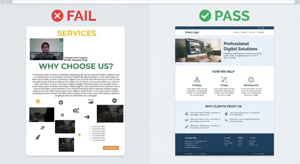
Unclear content structure makes information difficult to scan. Organize each page around a customer intent, then use descriptive headings, short paragraphs, lists, and visuals. Keep related information together so visitors can understand the offer without searching across sections.
For ecommerce pages, present product details, pricing, availability, shipping information, reviews, and purchase controls in a predictable order. For service pages, explain the service, benefits, process, proof, and next action. Consistent structure reduces effort and helps visitors reach decisions with fewer interruptions.
How to Fix Website Design Mistakes
To fix website design mistakes, audit the complete customer journey from the first page visit to the final conversion. Start with high-impact barriers: unclear navigation, slow pages, mobile usability problems, weak CTAs, inaccessible content, and broken forms.
Next, review trust elements, page structure, typography, colour contrast, and content clarity. Use real visitor behavior to prioritize fixes instead of redesigning every page at once. A professional web development agency can identify layout, usability, responsive design, and technical issues that remain easy to miss during internal reviews.
If the audit reveals deeper functionality or performance problems, review website development costs in Australia before planning larger technical changes.
Frequently Asked Questions
What are common website design mistakes?
Common website design mistakes include confusing navigation, slow pages, poor mobile responsiveness, weak calls-to-action, low contrast, excessive clutter, intrusive pop-ups, unclear value propositions, missing contact information, broken forms, accessibility issues, and failure to measure conversion performance.
What makes a website poorly designed?
A website is poorly designed when visitors cannot quickly understand the offer, find information, use essential features, or complete intended actions. Confusing navigation, unreadable typography, slow pages, weak CTAs, clutter, broken functionality, and poor mobile usability are common causes.
How can poor website design affect user experience?
Poor website design can make navigation difficult, slow access to information, reduce readability, create accessibility barriers, and prevent visitors from completing forms or purchases. These problems increase friction, weaken trust, and can reduce engagement and conversion performance across important pages.
What website design mistakes should businesses avoid?
Businesses should avoid confusing navigation, slow load times, poor mobile responsiveness, weak CTAs, low color contrast, excessive clutter, intrusive overlays, unclear value propositions, missing trust signals, broken forms, inaccessible interfaces, and failure to test conversion performance. Prioritize issues that block customer actions.